Sunday, October 4, 2009


By Katharine Widdows
Transparencies, Good Magazine

How did I miss this?

Good Magazine had an infographic contest with the assignment of comparing top CEO salaries to the average Joe. Take a look. They're impressive.


By Tanner Teale
Transparencies, Good Magazine

Friday, September 25, 2009

Wrodle

Today I discovered Johnathan Feinberg's Wordle, an online tool that takes gathered text (such as my design school application) and organizes it visually. An amazing free tool. You can pick your font, colors, orientation and even language. Check it out.


Design School Essay
using Wordle

Saturday, September 19, 2009

Ivy Games

It's been a while. Design school applications are eating all of my free time, but I wanted to share some work with you.
Ivy Games Logo copyright Ivy Games LLC 2009
I did this logo in 10 hours (cannot believe I could work this fast) for Ivy Games, a company that is teaming up with Hasbro and JET to produce Taboo: The Jewish Edition. I was lucky enough to be set up by a good friend who referred me to the CEO. I am very excited by the possibility of this logo being used on the game box and instructions that would be sold nationally.

Saturday, September 5, 2009

Sad day for futura

My favorite font, Futura, created by Paul Renner in the 1920s, known for being the first font on the moon and VW's chosen typeface, until recently was Ikea's go to font. Now they have replace it in their 2010 catalogue with Veranda, a typeface designed for the screen in 1996. Ikea claims they did it to so that their catalogues would work with Asian languages and could be used on computers. But they have lost so much. Instead of being Ikea-great design and for an inexpensive price, their font reads cheap.


Before (left) and after (right). Ikea Catalog.
Image from NYTimes.com


Here is the NYT article and a link to the Typophile (aka type geeks) form discussing it. As an Ikea customer, it just makes me sad to see them change their advertising campaign to "we're even cheaper" from "functional design"...guess these are the times...

Tuesday, August 18, 2009

Motion Final Teaser

Some of you have been asking what's new in my motion design class. A whole lot! This week is the last class so I'm polishing my final project, a minute and a half commercial to get the word out about how badly our schools feed our kids. Along with less physical activity, children's poor diet is has caused a record spike in youth onset diabetes, the type you can prevent. And while schools are trying to serve food the kids will eat and that's healthy for them, many just don't have the funds to prepare anything except frozen processed meals.

This fall The Children's Nutrition Act comes up to be renewed. Write your congressman/woman and tell them that it shouldn't just be pushed through without changes. With the budgets in almost every state taking massive cuts, we need to protect our children's health by making it a priority. More than 30 million children rely on school lunches to keep their bodies and mind strong and healthy and in this struggling economy with families scrimping at home, this means this may be the only 'decent' meal a child receives during the day! This isn't some suburban PTA campaign to get "better lunch meat in the cafeteria" (watch Clueless, 1995), it's more than that. It potentially could have a huge impact on national health care costs.

Here is the intro to my movie. I used stop animation to give it a home made look, like a school science project, and used my chalkboard drawing skills for most of the artwork. More to come by the end of the week.


School Lunch Intro.

For more information visit these sites:

Time for Lunch, Slow Food USA's site for school lunch reform, this is the site that is "sponsoring" my project. Great information on the Children's Nutrition Act and other sites

Whole Food's School Lunch Revolution Campaign with Chef Ann Cooper

School Lunch Talk, a blog co-edited by Deborah Lehmann and Ann Cooper with great summaries on current events in school lunch progress

Two Angry Moms, two moms who were surprised to learn what their children ate at school made a documentary (get a group together and watch it!), have appeared on talk shows such as Rachel Ray.

Empowerment Through Food, Project's H NYC chapter is designing gardens for schools which they can then use to learn not only ecology, but business skills, math as well as fundraising for the school (selling seedlings instead of wrapping paper or magazines) and promoting healthier communities

Friday, August 14, 2009

New Logos

What do you think of when you think of the old Apple computer logo? If you're me, it's the rainbow striped apple until a friend of mine forwarded this article on new logos.


Apple logos
before and after

The original Apple logo from '76 when the company was in the garage and the new logo on the right. Note the apple over Newton's head on the one one the left. They have come a long way.


British Petroleum logos before and after

I've found it interesting how a logo change can word for some companies and be negative for others. While a logo can look visually/design perfect, it can still be wrong it's off mark for the company's image, for example BP who wanted a new image but with oil spills was unable to achieve the environmental energy company look they yearned for.

Xerox logos
before and after

Then there is xerox. With such a strong logo, it's new one is plagued by the shadow of its predecessor.
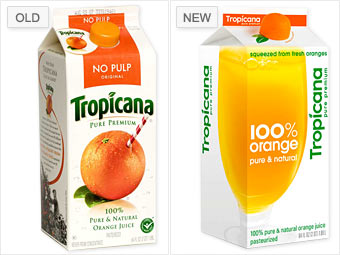
Tropicana logos
before and after

Or Tropicana, who wanted a modern new look for its design/packaging, only found that their change was too radical for their customer. Others said it look generic. Personally, I like how the cap is designed to look like an orange and the clean pure design of the carton. Some blame the company for not preparing the customers for the shift. If people cannot accept the change on a box of oj, well we're in trouble.

Monday, August 3, 2009

Posters

I'm in the middle of finals week at Art Center. Well not technically finals week (it's next week) but for me it is since it was the only week for my family's vacation this summer. I'm really looking forward to being all thorougher with them in Hawaii (!!) but am currently hurting a bit rushing to get my projects completed with one less week of class critiques.

Given the stress, I'd thought I'd procrastinate some more (because that 2 hour nap this afternoon was not enough) and put some links from my web searches. The theme: motivational posters (and no not the ones you see at office depot that say teamwork with a macro photo of ants working together). Enjoy!


I love this poster. It was originally used in Britain during WWII posted in London to keep the public, well calm. It's a great reminder even for today. Many many people are printing them...I'm not sure if it's copyrighted given it's English and quite old. I may do some research and try to buy one myself. They come in many colors including this red by The French Paper company is marked down to $15.


Two vintage posters from Roll and Tumble Press on Etsy that are in the same vein.


I love the texture in this print--how the letters are jagged. I only wish it was a really letterpress print and not inkjet...I know I'm picky. Ask anyone who has ever shopped with me. Click to get your own artistic reassurance.

Radical Thinking Logo

Another day, another logo. My new project is for a political blog that will be launched later this month called RadicalThinking.org. It examines current events and while is admittedly left-wing, has the goal of objectively examining pros and cons of proposals and actions of both parties. In some ways Radical Thinking is a play on words since his writings are not really radical but rather common sense in that he's willing to make compromises for the greater good. Here are a couple of working examples.

I used this font, Caslon Antique, because it feel like it has a history to, a texture, as if it's personal but also its heavy weight makes the logo feel powerful and strong. The scales symbolize justice, such as the lady justice motif.
Above "Radical" is in a script font called Zapfino. I had hoped this would make an inter sting juxtaposition between radical's definition and its shape. I also found out that radical does not only mean extreme, but it can also mean arising from or going to the root or the source. Since this blog's aim is to be similar to the revolutionary war movements such as the Federalist Papers, which were forward thinking and "radical" thought this might be a nice similarity.

This third version best highlights the scales and bolds "radical" the best. This is my favorite logo so far because of its strong solid shape and rectangle. My only worry is that it may be hard to read at first? Do you read T-Radical? Or do you read the T as an illustration and then as a letter in thinking? Leave a comment, let me know.
This final version is the most iconic. I think it was a good exploration, but it may be too abstract. I am tempted now to remove the words and just add an "R" to make it more of a initialed logo...this probably wouldn't work for a blog logo since it's highly important to share the domain, not just the logo-type. If my client had a huge advertising budget, he could do it, but this is just a small scale operation.

Sunday, August 2, 2009

Final OHS Logo


One Heart Source logo
digital (illustrator)

Ladies and gents it's finally done! After many hours in Illustrator moving letters a hair to the left, changing fonts and finishing the tree to make it look strong yet friendly...it's done! I was able to use both my teacher's/class's suggestions as well as my client. At first I was sad to see the curly "h" go, but sometimes we have to step leave a good idea to get to a great one. I'm happy to report that I received a 4 out of 4 on this assignment! No one gets a full 4 for 4. I'm seen amazing work get a 3.9/4...so I am very pleased my instructor liked it and feel OHS will also like it (I hope!).

Sunday, July 19, 2009

One Heart Source Logo

original OHS logo
www.oneheartsource.org

One Heart Source (OHS) is an orphanage in Tanzania. One of my good friends and former roommate helped start this organization after spending a summer in Africa with Students for International Change. The organization's goal is to break the cycle generational transmission of AIDS/HIV by providing health education as well as academic education in hopes to develop a new generation of advocates and leaders within Tanzania. They focus on education, public health and social change.


One Heart Source Logo
hand-drawn version

Since this is such a great cause, I thought I'd work one of my class assignments in. I am currently working on a new logo for them. My focus is to make on that appeals to both their sponsors by looking credible, but also appeal to the 'street kids' in Arush, Tanzania, whom are the organization's current target. Since there are language barriers as well as literacy barriers, I wanted it to be as pictorial as possible, to have a sense of comfort/home as well as familiarity. (Thus the acacia tree) On the business side it needs to look forward thinking, strong, and credible. To achieve this I'm making the type faces san serif for the most part (modern) and organized. The hardest thing to capture is the group's focus on social change and their idea that it starts with one. To focus in on this I drew the roots of the tree/heart growing from the "source" or foundation the logo all sits on. I chose a script font for "one" to make it seem more organic/familiar. This also gave me the opportunity to connect the "one" with the "t" of "heart". All these interconnections symbolize the connections within the organization and the children they help (almost like a family) as well as on a larger scale, it symbolizes a connection with every human being.

I'm still working on it though. Let me know if you have any ideas! I think I'm going to make the tree a bit smaller and the "heart" font less hand drawn. Moving it onto the computer!

Monday, July 13, 2009

Periodic Table of Typefaces + Game


Amazing. See if for yourself or get it printed on t-shirts and other merchandise.

And if you want to test your knowledge, try this type naming game...it's a bit addictive.

Wednesday, July 8, 2009

Gay Rights Poster Finished!

After eight weeks, I've finally finished my gay rights poster (and I'm so happy it's in the done pile!).


Gay is the new Black
type treatment for a 8.5"x11" poster

The hardest part of this logo was the overlapping of the script and preserving its legibility. I also changed the curl at the end of the "y" to mirror the "G". I placed this on a small poster, however, I had trouble posting the poster. I'll try again later.


Process Book
cover detail

Process books show the process of a work. They are great for potential employers who, while are interested in your final glossy portfolio of finished projects, also want to see how you work, your imagination and drawing skills.


Process Book
spine detail

I made my book using a saddle stitch spine with embroidery thread (that I've had since third grade..one point for the pack rat). The cover is made from a manila folder from Target. I noticed I really like working with my hands, verses the computer, making something tangible.


Process Book
cover page

This shot shows off the inside panel which has a fun retro pattern. You can also see some of the stitching on the spine.


Process Book
sample work page

I had pages and pages of sketches to sort through and scan in. Here is an example of some of the sketches that lead to my final product.

Saturday, July 4, 2009

Clowns & Social Conciousness

Professional clowns Seth Bloom and Christina Gelsone travel the world performing. Their performances have a social consciousness--educating about land mines awareness and malaria prevention. Here is the link to a short movie by the NYT.

Happy fourth!

Wednesday, July 1, 2009

Raymond Logan & Edward B Gordon

Pressure by Raymond Logan 6"x4"
copyright Raymond Logan

I received an e-mail from a friend of mine, Raymond Logan, who does daily oil paintings (above). First his dailies are amazing little works. The size of a 6x4 photo, still objects come to life. My favorites are his toy soldiers (green men) and three tangerines. It's almost as if he's been allowed into the world of "Toy Story" and can capture these inanimate objects' emotions.


Touched by Sun Light by Edward B. Gordon 5.9x5.9"
copyright Edward B. Gordon

The e-mail he sent me was about another daily painter, Edward B. Gordon, who lives in Berlin. His dailies are 6x6" and usually involve people of Berlin. They are spectacular!! The way he captures light with oil paints is breath taking. If you go on his website, sadly, he's announced that many of his works have been ripped off by Chinese manufacturers! :(

I think I am so drawn to Gordon's work because they remind me of how I watercolor. Two very different mediums (we're talking oil and water here) but can have the same feeling! Magnificent. I would include a picture of a watercolor I did of myself as a preschooler but sadly it did not make it to digital form before it was misplaced (I cannot admit to myself that it is lost although I haven't seen it since high school)...

Tuesday, June 30, 2009

The Gay Arguement, Visualized


(click the image to see the entire thing)

Found this diagram on GOOD's website. It reminded me a lot of those quizzes in Seventeen magazine where one answer leads to another (or those 'create your own chapter books') While I think it is a beautiful diagram, it saddens me that there is no clear solution. Then again, I don't feel like all the arguments are even legitimate. However some are pretty funny, "I'm not a bigot: I hate the sin, but love the sinner" and "I'm not gay but I still need a catagory of humans I can look down upon" sad, but true.

Monday, June 29, 2009

Gay is the new Black

So I need a little help. Below are three versions of a poster slogan for gay rights. My aim is to compare gay rights to civil rights movements in a way to motivate my generation to realize that just because they may not be effected directly--we're talking about equality here.


Version 1

The original sketch as it was done before we scanned it into Illustrator and made it digital. I like this one because the flourish on the "y" has a lot of 'breathing' room and therefore is accented.
If I kept this one I would align the lower case "w" in new with the stroke of the "k" in black so that they were part of the same imaginary line. I also moved the squirl on the "G" up above the "BLACK" so it didn't look like I was dotting part of the "L" as an "i".


Version 2

This one highlights the "G" in gay.I don't really like the "L" or the "CK"'s placement over the flourishes...what do you think? I want it to feel like gay is rising up out of black, however here it looks like black is on top of Gay. I do like that "gay" is more balanced on the work "BLACK" though.


Version 3

This is the same as version 2 except it has cutouts where the two words "gay" and "BLACK" overlap. I really like this one but am worried about legibility. To me it feels like "gay" is blurring out Black, as if it is a thing of the past, and Gay is taking it's black in terms of importance. Is it illegible? or is it worth doing to draw viewers in? Remember this will be on a 8.5x11 poster. I'll post layouts later...

Comments would be appreciated. Let me know what you think.


Project H


This past weekend I attended the Dwell on Design conference at the LA convention center. After being blown away by all the inventive home design products (solar panels that look like climbing ivy, recycled plastic bottle chandeliers, and repurposed wine bottle spoons...), I happened to walk into a talk by Emily Pilloton, founder and director of Project H. Their mission is to support, create and deliver life-improving humanitarian product design solutions.

Learning Landscapes tire playgound teaches math

I immediately took a seat to listen to the last bit of her talk. Project H has several chapters in different cities throughout the world. They are working on a repurposed tire playground that teaches math that can be made anywhere. I loved how interactive this idea was. It gets students moving, teachers get direct feedback on how well students understand a concept and it can grow with the students as they learn more advanced concepts (even algebra!).

'double function products' such as this tote bag/hammock were made by the LA chapter of Project H

The chapter in LA works with the Downtown Women's Center to provide skills and products to help homeless women. They invented a tote bag that can become a hammock, a hoodie that has storage compartments and other products. They are actually made and sold at the center by these women.

Wednesday, June 10, 2009

My work on display!


Exciting news! I got a piece of my work from last fall into UCLA Extension's The 2009 "It's Your Show" .

The unveiling is on Friday June 26th
6:30-9 pm, at UCLA Extension’s 1010 Westwood Center Gallery if you're around, please stop by. :)


According to their website, special recognition will be given by a jury of Los Angeles artists to projects displaying excellence in specific elements of art and design.


Otherwise, it will be up until July 16th.

Tuesday, June 9, 2009

Anti-Traffic

Today I worked on my video for the opposite of traffic--free, flow, movement, constant speed, and peacefulness. Here it is. See the original "traffic" video in the previous post.


Anti-Traffic

(12 seconds)
After Effects & Illustrator

Next: combining the two into one video

Monday, June 8, 2009

Traffic Video

Here it is ladies and gents!

An example of my work from my Motion Design class at Art Center this term. It's one of three movies in a series. I was recently inspired by GOOD magazine's latest issue on transportation (and the lack of it) in LA. So my issue is LA transportation: looking at the present: traffic and the future: not traffic. The next video will be anti-traffic (think serenity and flow) and the final one is the issue at large (a combination of the two forces). This video has been good therapy for the hours of life I have sat in traffic down here in la la land. Enjoy!


Traffic
(9 seconds)
After Effects & Illustrator

Ironically on the way home from the downtown LA library, where I was working on this project, we saw a 5 car pile up...cross your fingers I'm not next!

This video was made using After Effects and is my hard work so please do not steal. :) Contact me if you want to know more.

Product Design Before & Afters

So what's the most boring thing in the world? Wheat bread packaging might be one of them. But not anymore! Check out Silver Hill Bakery's redesign on the dieline.com (scroll almost to the bottom of the page to find it) Just a little taste of how design is everywhere. Plus it gives me hope that I will have a steady job when all of my training is 'over'. (see their article on Recession Proofing Packaging)

On a slightly different note I also came across a new design resource while browsing the web. (I'm beginning to realize the web is HUGE! I haven't even tapped into the design resources avaliable) The site, design:related, is, as the name suggests, for anything related to design. You can post your work in a virtual portfolio as you post pictures to facebook or flicker. Plus it has job postings (!-wish I was more qualified), news in design, inspiration and highlights. What really struck me is how high quality the work is. Most of it you'll probably recognize from just being a consumer. I encourage browsing...lots of book and editorial design. mmmm yummmy!

Friday, June 5, 2009

Microsoft's iPod + Did you know?

Two great videos for you to check out:

1. A great parody addresses the question, what if Microsoft sold the iPod, what would their product's boxy look like?


2. This video is about the exponential growth of available information in our society and what might happen in the future.

L!BRARY

For anyone who likes books, education and/or design, this is amazing.

http://pentagram.com/en/new/2009/03/murals-for-the-library-initiat.php#more


Pentagram, one of the best US design firms, and the Robin Hood Foundation, an initiative to build new school libraries in elementary schools throughout the five boroughs of New York City, put their forces together for good. After nine years, what started as a project that included signage, way finding (maps, directional signs ect), and branding, turned even more creative when they noticed the unused space above the bookshelves in these high ceiling rooms. Obviously it's out of reach for students, so books aren't stored there, but it doesn't mean it should be left alone. The answer are these wonderful murals, quotes, and installations to spark imagination and encourage reading.


Instillation based on Lewis Carrol's Jaberwocky.
Pentagram & Robin Hood Foundation

"As P.S. 47 librarian Joanne Davis told the Times, 'A lot of students here have never been in a school library or even a public library.” Robin Hood executive director David Salzman observes that each school library impacts “5 percent of a school’s real estate but 100 percent of its students.'"


Library PS287
Pentagram & Robin Hood Foundation

Monday, June 1, 2009

Our Home Gallery

So this weekend my boyfriend, D, got a bad cold, or as he would called "death flu". This was also the weekend I decided to put my foot down, print some pictures out, and put some frames up over our couch. It should be noted that these frames were purchased in January from the Burbank IKEA. While D did do all of the printing from his 'Jesus printer' I did all the measuring, alignments and actual, how do you say, man work. Now Derek, feeling much better today, wants to find a low-end, on the cheap, renter's Home and Garden to post our work to. My answer, the Jacqueline Stark blog. Enjoy

Before:
our plain, sad, white renter's walls


The floor plan, literally:


Derek decided to document my hard work...at this point the apartment is sweltering hot because Derek insists he cannot be cold while he has a fever and the oven is heating up as I multi-task between hammering and cooking.

After:
Ta-da!!


Victory dinner. Note the little ottoman cubes, a recent pick up from Target, are fantastic versatile players--extra seating, tables tops (when you turn over the cushions) and storage.


And this morning, I decided to also put our other IKEA purchases in their place on the wall and off of the floor. Here is the bamboo wall hanging that has been gathering dust on our floor. Now it's in its rightful place behind D's huge TV.


PS our new vacuum was delayed until the 3rd...life is quite exciting here.

Have a creative day.

Saturday, May 30, 2009

Fast Company's 100 Most Creative People in Business

I came across an amazing list of creatives in business this morning while checking out one of my guilty pleasures, The Sartorialist blog.

Check out the list yourself:
100 Most Creative People in Business

I found my most inspiring notables at the end of the list. The unknown to the mass public (unlike Melinda Gates, JJ Abrams, Tyra Banks, Johnathan Ive, and Stella McCarthney types who make up the first 50 or so...although I do not mean to under mind their accomplishments in the least) are the most compelling to me because I feel like their accomplishments are similar to goals I am shooting for myself.

My favorites include:

74. Gary Hustwit
-who created the film Objectified (similar to Helvetica documentary), clocked 20 years in DIY media, and has his own company Plexifilm thst is releasing some of Andy Warhol's films on DVD

67. Julieann Kost- senior digital imaging evangelist at Adobe, she recently did a photo series taken from airplane window. A tech-y and a creative all in one.

59. Noah Brier- head of strategy for Barbarian group, "A self-described tinkerer, he feeds his online-strategy work for clients including GE and Dove by creating, on his own time, compelling projects at the intersection of social media, digital advertising, and anthropology." Talk about a Renaissance man of the 21th century...oh and he's only 27.

82. Michael Patrick Cronan-CEO Cronan, a graphic designer/Ad man who focuses on the importance of product's name, for example TiVo and Amazon's Kindle. Oh and he's also a Berkeley man and thus a do-gooder..."among their best names: a charity called Children's Health Environmental Coalition that became "Healthy Child Healthy World" in early 2007. Two years later, donations are up 700%"

52. Kyle Cooper-President of Prologue Films, the company that made Brad Pitt look like an old man in The Curious Case of Benjamin Button. "My job is to make people in the theater feel like they don't want to be anywhere else," says Kyle Cooper. View their AMAZING montage of works (on the left hand bar: reel/montage) and see how many you recognize.

29. Alexandra Patsavas- sets music to pictures including Mad Men and Grey's Anatomy

Other notables, 17. Stephen Chau (came up with the idea for google map's street view), 76. Piet Oudolf (garden designer), 37. Shai Reshef (who offers an alternative to expensive high education with his University of People concept-only pay for exams and registration, learning in an open source environment) and 20. Dawn Danby (sustainable design program manager, Autodesk, her site is a great source)

Go, explore, there is so much to do.

I know I now have a few people I can talk about for my 'designers who will shape the future' essay for my applications.

Go have a creative day.

Wednesday, May 27, 2009

Book Club Website

After a much needed break, I'm back in design action. I'm two weeks into my summer courses at Art Center in Pasadena where I am taking Typography 1 (with Adele Bass a legend in type) and Motion Design where I'm learning to use After Effects and the design of graphics in motion (not actual motion pictures).

In my type class I'm working on rendering some lettering for a poster campaign. We were asked to pick a controversial topic and come up with a slogan. I chose "Gay is the new Black" to promote awareness of violations of constitutional rights against homosexual Americans by comparing gay rights to the African-American civil rights movement.

For my Motion Design class I'm working on a short animation about a 'personal space'. I chose to document YRL, a library on UCLA's campus, where I spent a lot of nights studying neuroscience. I hope to post the quick time movie when I'm finished with the assignment in a couple weeks.

From the freelance world I've finished a project for the book club Belles Femmes-Belles Letteres!

www.bellesbookclub.com

It's live however, we're still adding information, such as a 'belle' rating system for the books. Check them out. As they have been together since 1991, they have read over 200 books! Get your summer read ideas here.

On the school front, I'm preparing my portfolio and attacking essays to enroll in Spring '10 programs in graphic designs. So far I'm applying to Art Center and CCA. During the break I was able to visit CCA in SF and am happy to report that my portfolio was already approved! Now I just need to make it ArtCenter perfect and write some essays.

Have a creative day!

Wednesday, April 15, 2009

Vintage Store Logo System

I just finished a logo system for a store I thought up. Vintage stores are doing well in this current economic climate and I wanted to put my spin on a store. I came up with a store called Second Chances and New Romances. It's a vintage clothing store that sells primarily sells 1950s wear but not just retro threads. The also sell clothing made today using vintage patterns and recycled/retro fabrics, such as table cloths and drapery from the era. I like this intermixing of yesterdays' clothing in a modern setting and kept this in mind when I was working on the logo below.

3-Color Logo

Above is the logo. After going through a lot of retro type faces I decided on a script. I was inspired by the Beverly Hills Hotel logo which is retro yet not kitchy. It has a class feel. I chose the button as the icon because it represents vintage clothing. Add a new button, a new bow---make it new. Twinkles were added for nostalgia. The colors are feminine, pink, and green was chosen as its a complement and as an echo of the 'avocado' appliances available during the era. Instead of black I used a deep chocolate brown to keep the button warm and retro (as if a sepia photograph, faded with time).


Letterhead System

I designed this system with the idea that getting a letter from this store shouldn't feel corporate or like a bill. I wanted opening an envelope to feel like a letter from an old friend or your favorite aunt. With this I kept the stationary pages simple and white to make them modern, although I added the twinkles from the first to the second page (to add consistency to the system). The envelope is the first thing a receiver feels. I chose a pink #10 manila envelope (like the ones available through Paper Source) because it was feminine and retro. It reminded me of the manila envelopes used before e-mail for inter-office memos (think Mad Men). I added printed buttons to the brackets and pink embroidery thread to tie it together. The pink thread matches the thread on the button.


Business Card

The business card is in a portrait layout (detail above, ignore the one on the letterhead spread, it's an old version). I placed the logo at the top and the information centered below it. I envisioned the button as the face and the text as the flowing hemline below it. The circular mailing label brings the buttons from the envelope around the edges. The circular shape is softer, echos the shape of the button, and the buttons make it feel like a doilee (check that spelling?) underneath a tray of sweets.


These two images back up the front and back of the hang tag. Picture a line of clothing all with little green buttons on their sleeves! The front is full brightness and the back is ghosted to add contrast with the name, size and price. I differentiated the sides so that it's easy to find the copy information. The button tag is affixed to the garment with brass safety pin and pink embroidery thread (same as the envelope).
The final piece of collateral is the shopping bag. It's 16" wide, a foot high and 6" deep--perfect size for a dress. The front has a simple design of the logo, the side panels have the strawberry/watermelon pink, and the back has a wallpaper of green buttons. I went with this combination because it advertises the company, is modern (with the repeated button), and catchy.

I presented this system last Monday to my class as my final. I set up all my boards and mocked up the tag and the bag in addition to bringing in ribbons, my sewing box, a mirror, heels, and some make-up to create a scene. A classmate of mine took a picture so I hope to post it soon!