Tuesday, August 18, 2009

Motion Final Teaser

Some of you have been asking what's new in my motion design class. A whole lot! This week is the last class so I'm polishing my final project, a minute and a half commercial to get the word out about how badly our schools feed our kids. Along with less physical activity, children's poor diet is has caused a record spike in youth onset diabetes, the type you can prevent. And while schools are trying to serve food the kids will eat and that's healthy for them, many just don't have the funds to prepare anything except frozen processed meals.

This fall The Children's Nutrition Act comes up to be renewed. Write your congressman/woman and tell them that it shouldn't just be pushed through without changes. With the budgets in almost every state taking massive cuts, we need to protect our children's health by making it a priority. More than 30 million children rely on school lunches to keep their bodies and mind strong and healthy and in this struggling economy with families scrimping at home, this means this may be the only 'decent' meal a child receives during the day! This isn't some suburban PTA campaign to get "better lunch meat in the cafeteria" (watch Clueless, 1995), it's more than that. It potentially could have a huge impact on national health care costs.

Here is the intro to my movie. I used stop animation to give it a home made look, like a school science project, and used my chalkboard drawing skills for most of the artwork. More to come by the end of the week.


School Lunch Intro.

For more information visit these sites:

Time for Lunch, Slow Food USA's site for school lunch reform, this is the site that is "sponsoring" my project. Great information on the Children's Nutrition Act and other sites

Whole Food's School Lunch Revolution Campaign with Chef Ann Cooper

School Lunch Talk, a blog co-edited by Deborah Lehmann and Ann Cooper with great summaries on current events in school lunch progress

Two Angry Moms, two moms who were surprised to learn what their children ate at school made a documentary (get a group together and watch it!), have appeared on talk shows such as Rachel Ray.

Empowerment Through Food, Project's H NYC chapter is designing gardens for schools which they can then use to learn not only ecology, but business skills, math as well as fundraising for the school (selling seedlings instead of wrapping paper or magazines) and promoting healthier communities

Friday, August 14, 2009

New Logos

What do you think of when you think of the old Apple computer logo? If you're me, it's the rainbow striped apple until a friend of mine forwarded this article on new logos.


Apple logos
before and after

The original Apple logo from '76 when the company was in the garage and the new logo on the right. Note the apple over Newton's head on the one one the left. They have come a long way.


British Petroleum logos before and after

I've found it interesting how a logo change can word for some companies and be negative for others. While a logo can look visually/design perfect, it can still be wrong it's off mark for the company's image, for example BP who wanted a new image but with oil spills was unable to achieve the environmental energy company look they yearned for.

Xerox logos
before and after

Then there is xerox. With such a strong logo, it's new one is plagued by the shadow of its predecessor.
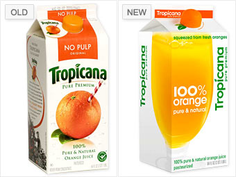
Tropicana logos
before and after

Or Tropicana, who wanted a modern new look for its design/packaging, only found that their change was too radical for their customer. Others said it look generic. Personally, I like how the cap is designed to look like an orange and the clean pure design of the carton. Some blame the company for not preparing the customers for the shift. If people cannot accept the change on a box of oj, well we're in trouble.

Monday, August 3, 2009

Posters

I'm in the middle of finals week at Art Center. Well not technically finals week (it's next week) but for me it is since it was the only week for my family's vacation this summer. I'm really looking forward to being all thorougher with them in Hawaii (!!) but am currently hurting a bit rushing to get my projects completed with one less week of class critiques.

Given the stress, I'd thought I'd procrastinate some more (because that 2 hour nap this afternoon was not enough) and put some links from my web searches. The theme: motivational posters (and no not the ones you see at office depot that say teamwork with a macro photo of ants working together). Enjoy!


I love this poster. It was originally used in Britain during WWII posted in London to keep the public, well calm. It's a great reminder even for today. Many many people are printing them...I'm not sure if it's copyrighted given it's English and quite old. I may do some research and try to buy one myself. They come in many colors including this red by The French Paper company is marked down to $15.


Two vintage posters from Roll and Tumble Press on Etsy that are in the same vein.


I love the texture in this print--how the letters are jagged. I only wish it was a really letterpress print and not inkjet...I know I'm picky. Ask anyone who has ever shopped with me. Click to get your own artistic reassurance.

Radical Thinking Logo

Another day, another logo. My new project is for a political blog that will be launched later this month called RadicalThinking.org. It examines current events and while is admittedly left-wing, has the goal of objectively examining pros and cons of proposals and actions of both parties. In some ways Radical Thinking is a play on words since his writings are not really radical but rather common sense in that he's willing to make compromises for the greater good. Here are a couple of working examples.

I used this font, Caslon Antique, because it feel like it has a history to, a texture, as if it's personal but also its heavy weight makes the logo feel powerful and strong. The scales symbolize justice, such as the lady justice motif.
Above "Radical" is in a script font called Zapfino. I had hoped this would make an inter sting juxtaposition between radical's definition and its shape. I also found out that radical does not only mean extreme, but it can also mean arising from or going to the root or the source. Since this blog's aim is to be similar to the revolutionary war movements such as the Federalist Papers, which were forward thinking and "radical" thought this might be a nice similarity.

This third version best highlights the scales and bolds "radical" the best. This is my favorite logo so far because of its strong solid shape and rectangle. My only worry is that it may be hard to read at first? Do you read T-Radical? Or do you read the T as an illustration and then as a letter in thinking? Leave a comment, let me know.
This final version is the most iconic. I think it was a good exploration, but it may be too abstract. I am tempted now to remove the words and just add an "R" to make it more of a initialed logo...this probably wouldn't work for a blog logo since it's highly important to share the domain, not just the logo-type. If my client had a huge advertising budget, he could do it, but this is just a small scale operation.

Sunday, August 2, 2009

Final OHS Logo


One Heart Source logo
digital (illustrator)

Ladies and gents it's finally done! After many hours in Illustrator moving letters a hair to the left, changing fonts and finishing the tree to make it look strong yet friendly...it's done! I was able to use both my teacher's/class's suggestions as well as my client. At first I was sad to see the curly "h" go, but sometimes we have to step leave a good idea to get to a great one. I'm happy to report that I received a 4 out of 4 on this assignment! No one gets a full 4 for 4. I'm seen amazing work get a 3.9/4...so I am very pleased my instructor liked it and feel OHS will also like it (I hope!).