What do you think of when you think of the old Apple computer logo? If you're me, it's the rainbow striped apple until a friend of mine forwarded
this article on new logos.
 Apple logos
before and afterThe original Apple logo from '76 when the company was in the garage and the new logo on the right. Note the apple over Newton's head on the one one the left. They have come a long way.

British Petroleum logos before and after
I've found it interesting how a logo change can word for some companies and be negative for others. While a logo can look visually/design perfect, it can still be wrong it's off mark for the company's image, for example BP who wanted a new image but with oil spills was unable to achieve the environmental energy company look they yearned for.
 Xerox logos before and after
Then there is xerox. With such a strong logo, it's new one is plagued by the shadow of its predecessor.
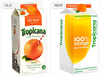 Tropicana logos before and after
Or Tropicana, who wanted a modern new look for its design/packaging, only found that their change was too radical for their customer. Others said it look generic. Personally, I like how the cap is designed to look like an orange and the clean pure design of the carton. Some blame the company for not preparing the customers for the shift. If people cannot accept the change on a box of oj, well we're in trouble.


 Posts
Posts


No comments:
Post a Comment